AllTimeHalf is an online forum dedicated to cryptocurrency and decentralized technologies, launched to mark the halving event.
The project included:
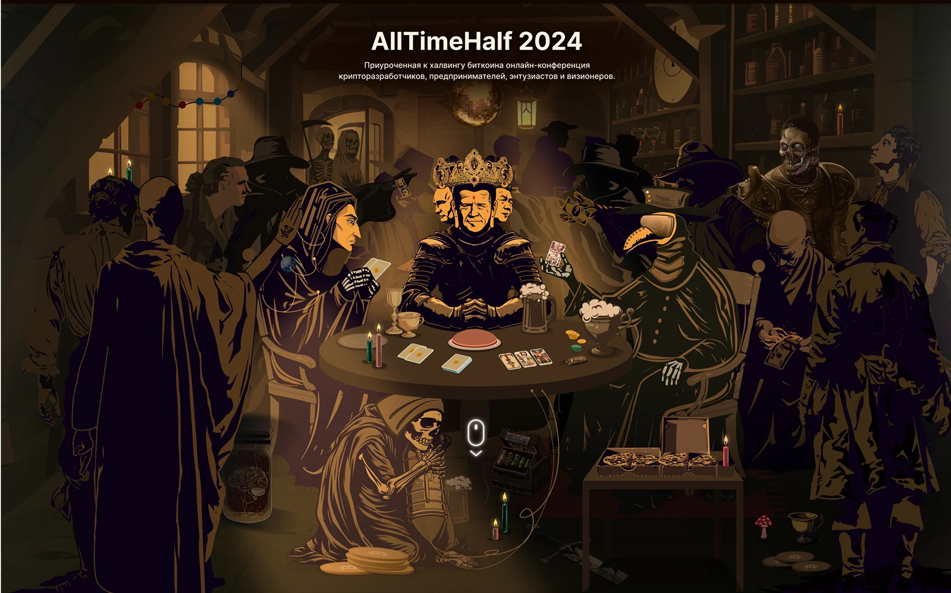
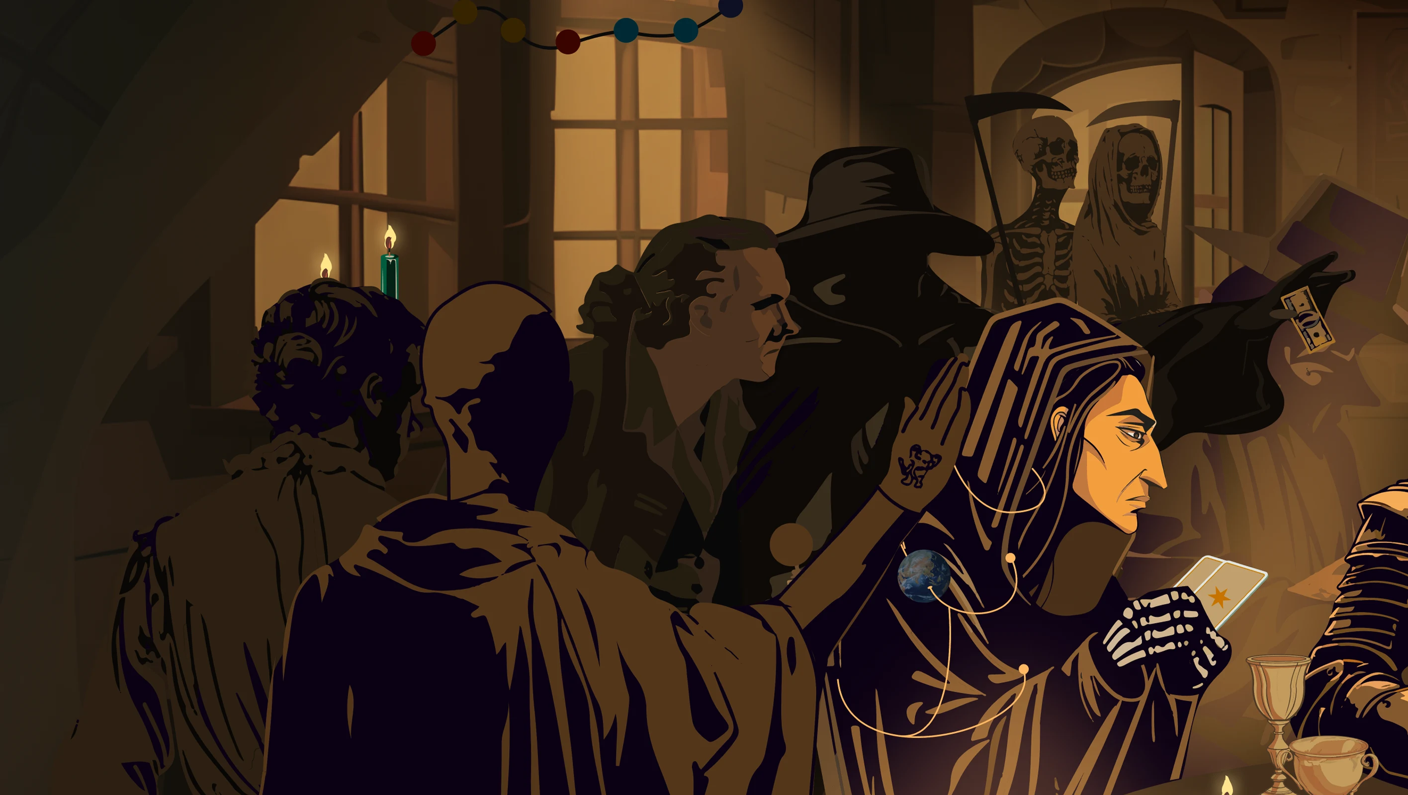
- Illustration inspired by the Four Horsemen of the Technological Apocalypse.
- Landing page design based on the key visual.
- Event branding and visual identity.
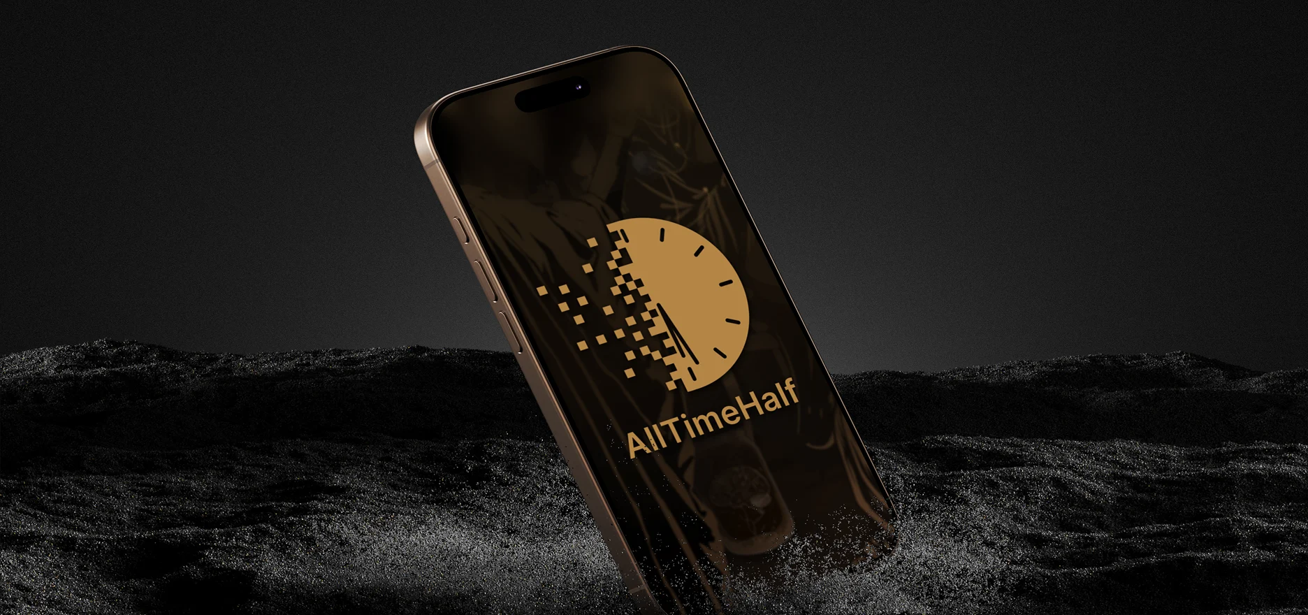
Logo design
The logo is based on a clock face, symbolizing the passage of time and the halving moment. The form gradually dissolves into pixels, reflecting digital transformation and the technological nature of the project.
Research steps
- Competitive Research
Analyzed crypto conference and event websites to identify common patterns, effective content structures, and opportunities for a more distinctive visual approach. - Concept Development
Developed a metaphorical concept inspired by the Four Horsemen of the Apocalypse, reimagining them as symbols of the technological challenges shaping the crypto industry.
Research of content hierarchy and branding patterns across competitors
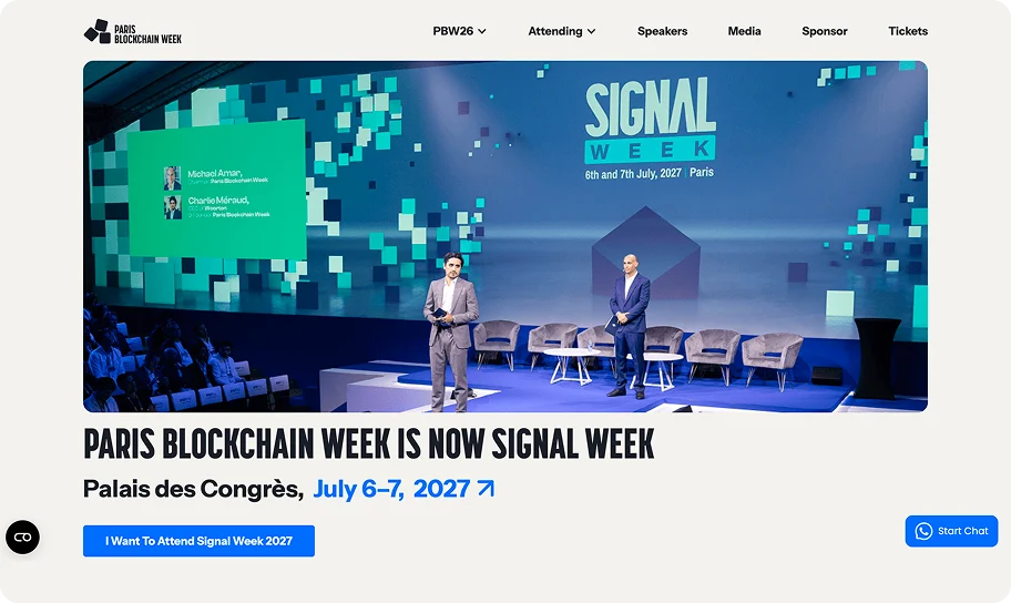
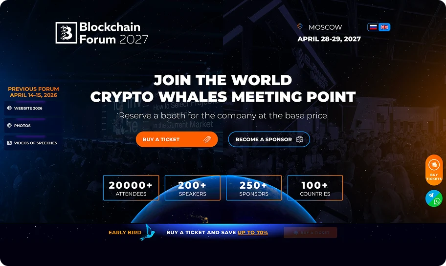
UI design
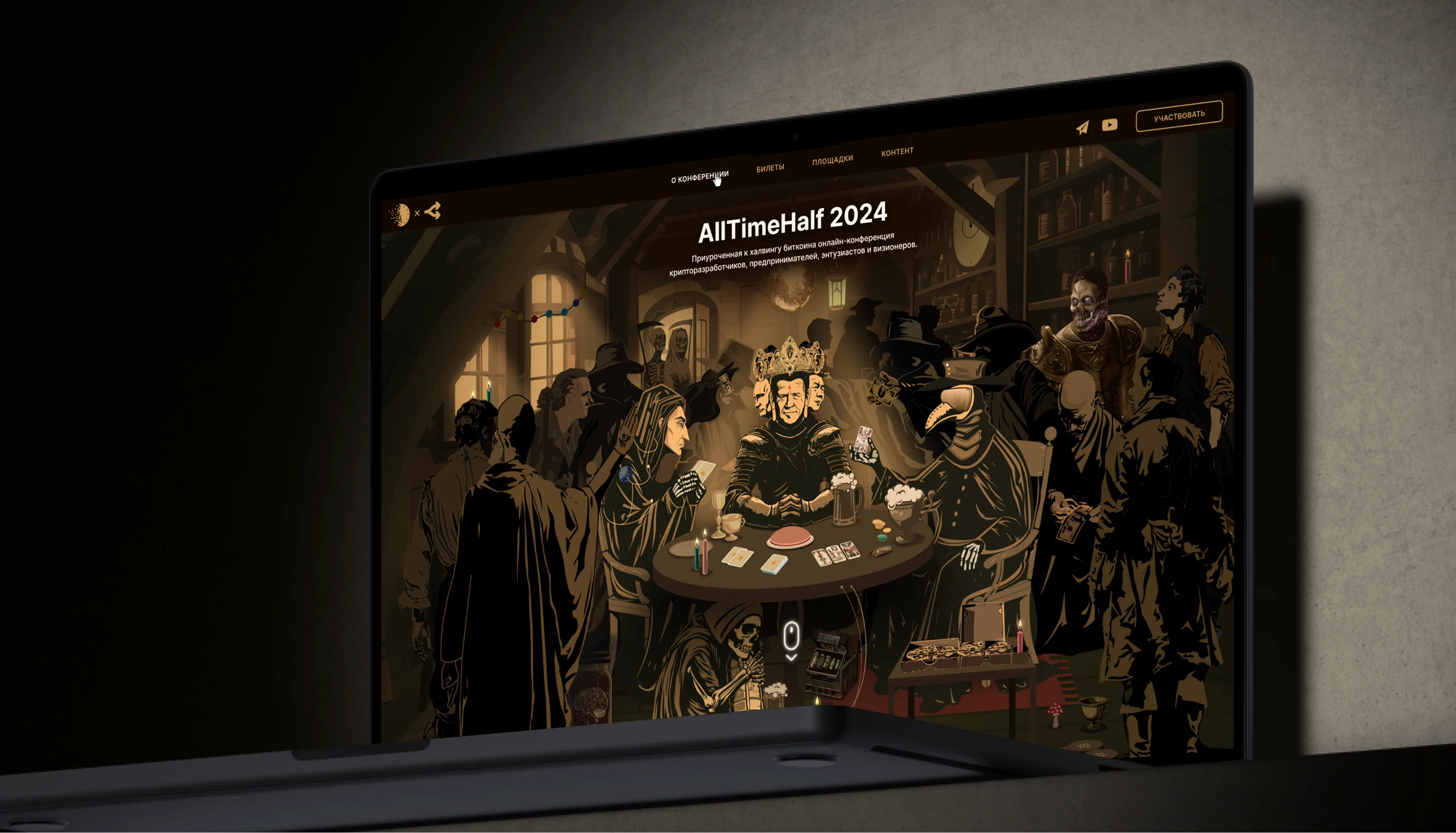
Following the research and the sign off the wire-frames I began design of the user interface. I created an illustration symbolizing the Four Horsemen of the Apocalypse: War, Plague, Famine, and Death. They are all seated around a table playing cards, with ominous red buttons within reach. Scattered around them are bitcoins, pizza slices, and people observing the scene with fascination.
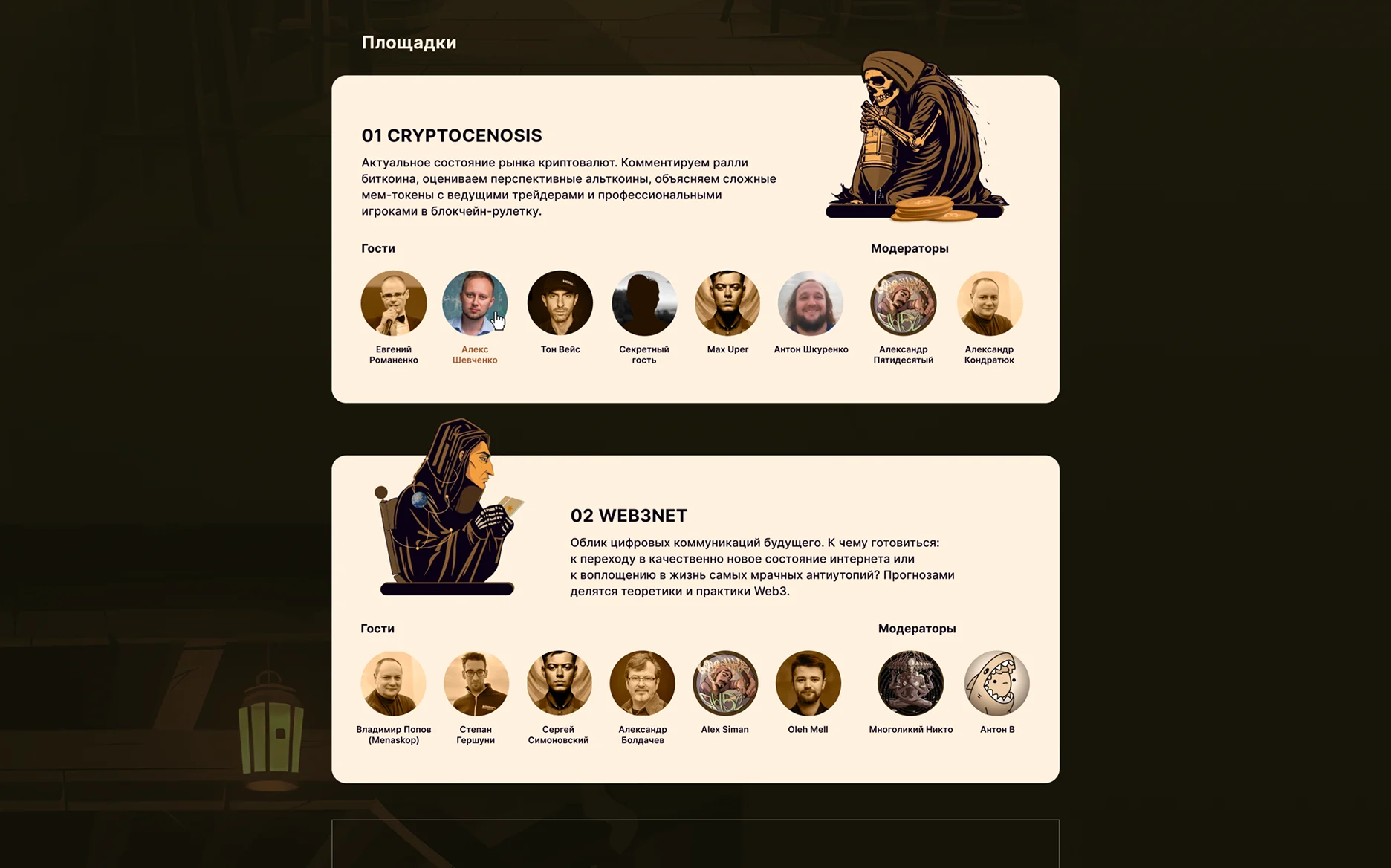
Below the illustration, the landing page features content blocks describing each conference section, speaker information, key topics, and a contact form. The visual style is mystical and dark, designed to evoke a sense that the fate of the world is being decided right here, right now.
Simplified the navigation by prioritizing the most frequently used sections in the main menu. Structured the key event details and navigation into a clear, easy-to-scan information block. Also added a live countdown and a prominent VIP ticket call-to-action to build anticipation and guide users toward registration.

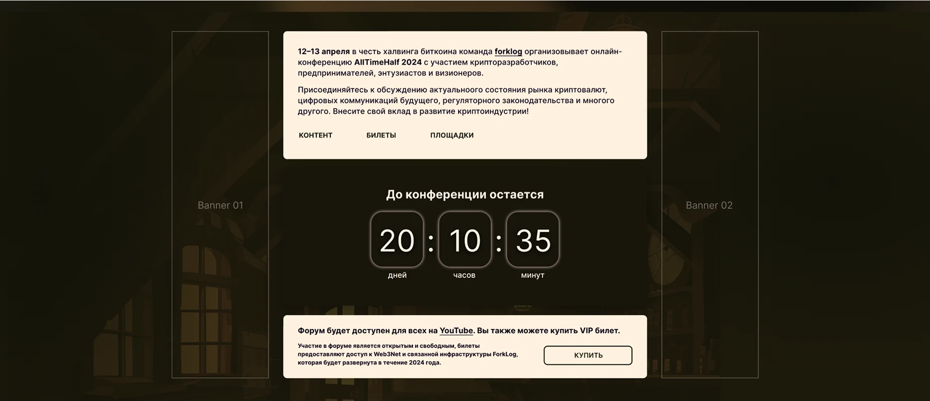
Adapted the landing page for mobile screens by reorganizing content into a clear vertical flow, simplifying navigation, and optimizing typography, illustrations, speaker profiles, and calls to action for comfortable browsing on smaller devices.
Typography
Inter was selected for its clarity, excellent on-screen readability, and clean contemporary character. Its versatile type system supports a strong visual hierarchy while balancing the project's detailed illustrations and dark atmospheric aesthetic.
Inter
ABCDEFGHIJKLMNOPQRSTUVWXYZ
abcdefghijklmnopqrstuvwxyz
1234567890
Colors
The palette is built around a near-black background, a warm caramel-gold accent used for the illustration and key calls to action, and a soft canvas tone for supporting surfaces — keeping the same candlelit, mystical mood across every touchpoint.
Result: The landing page delivered strong results, achieving a high ticket-purchase conversion rate and receiving numerous positive reviews from conference participants.