Forklog is a blockchain and AI media platform. The task was to update the website, logo and create a new brandbook to improve conversion rates and increase audience engagement.
The project focused on redesigning a complex editorial ecosystem by:
- Redesigning the visual identity.
- Improving navigation and content discoverability.
- Simplifying high-density interfaces.
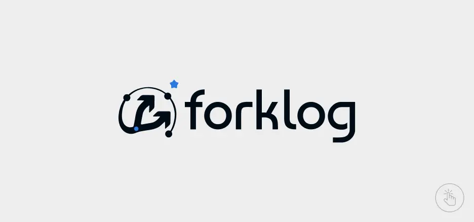
Main logo design
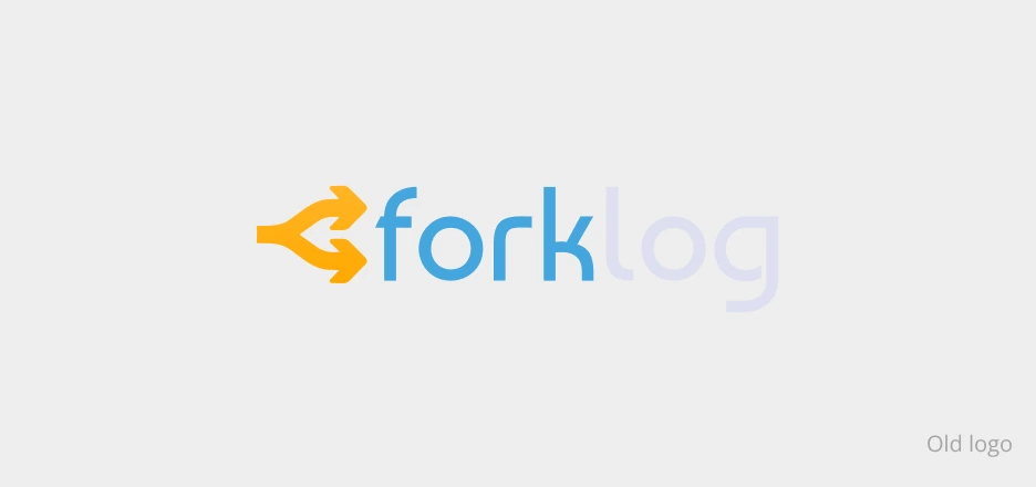
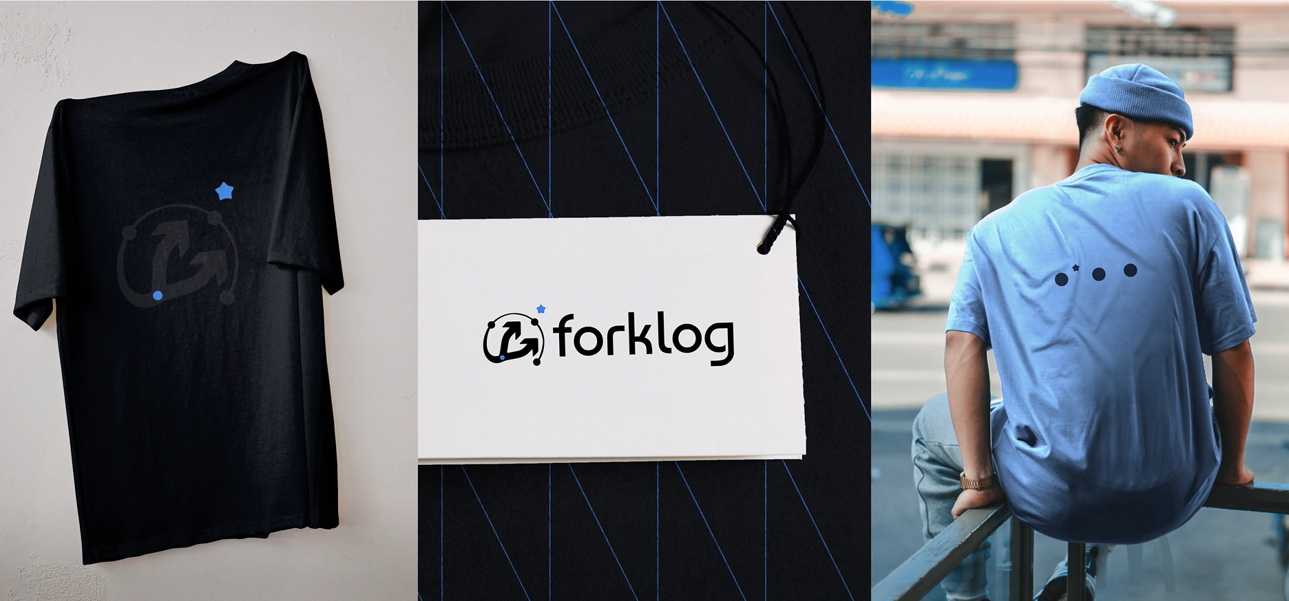
The logo is a sign created on the basis of the previous version of the fork/arrow and the circles and star surrounding it, and the text part, while maintaining the corporate font. Improved logo visibility across all background types.
Research steps
- Evaluation of the existing visual identity and user experience.
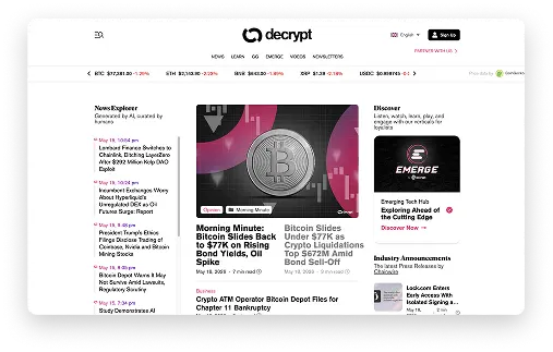
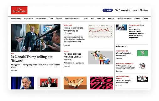
- Competitive research across crypto and technology media platforms.
- Analysis of editorial hierarchy, navigation, and content systems.
Research of content hierarchy and branding patterns across media competitors
UI design
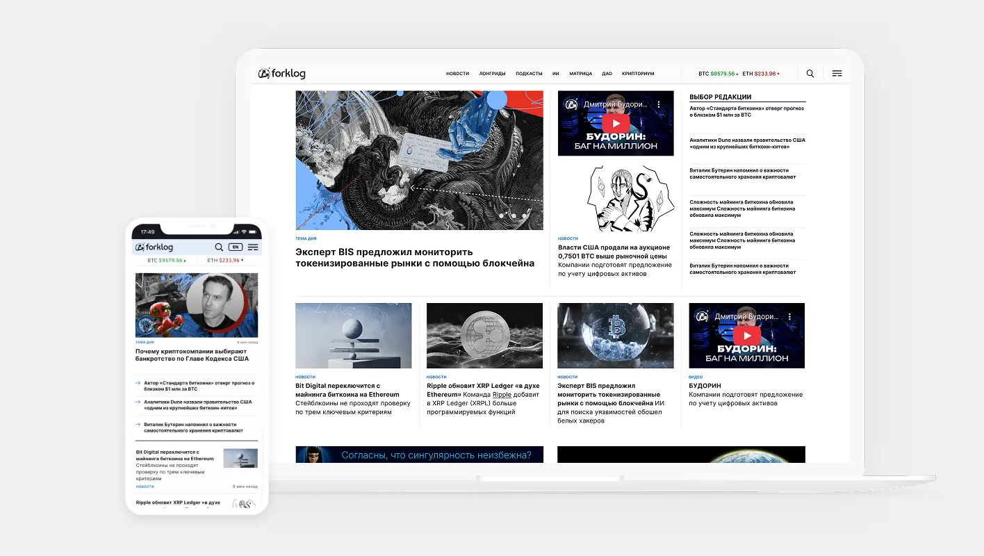
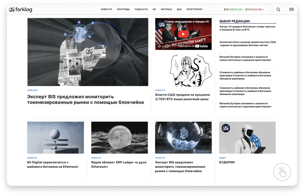
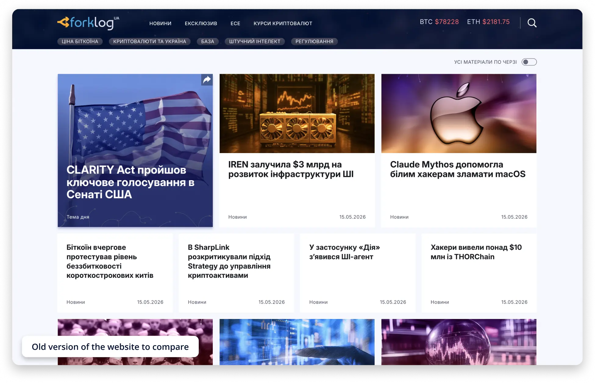
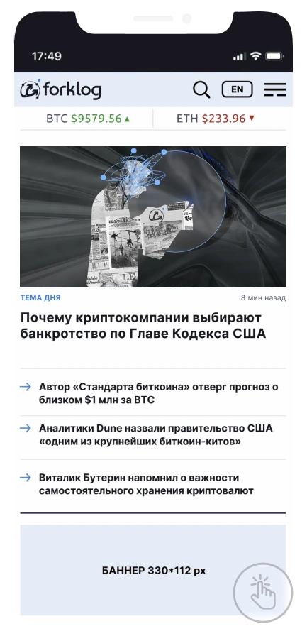
The homepage needed to include the topic of the day, videos, short-form content, a curated editor's picks section, as well as a mix of news and longreads. I structured all of this into a clean, intuitive layout with clear emphasis points, ensuring high information density without overwhelming the user.
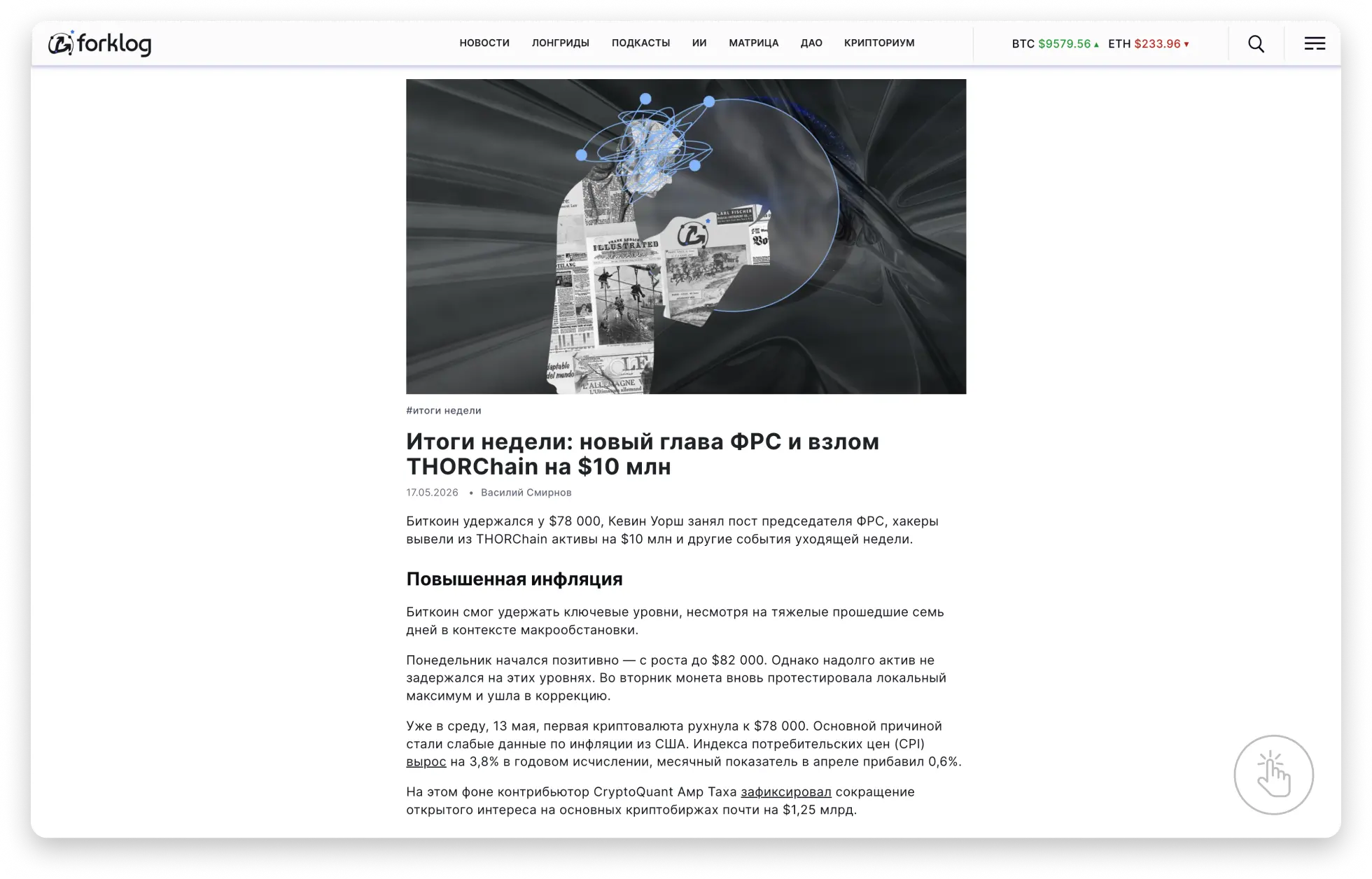
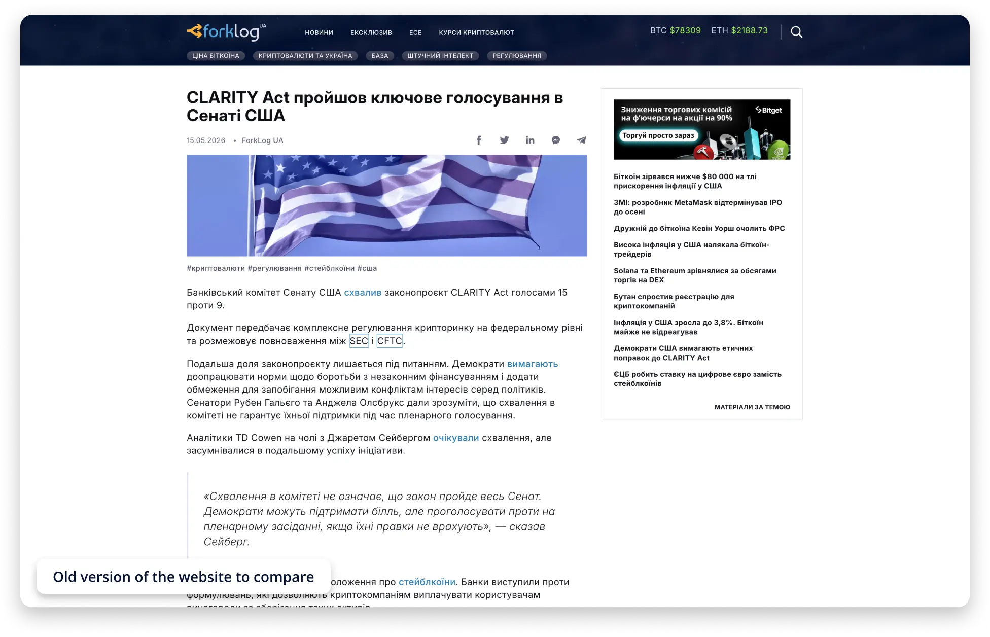
Simplified the article page experience by reducing visual noise and shifting the focus toward long-form reading, resulting in a 1.5× increase in average session duration.
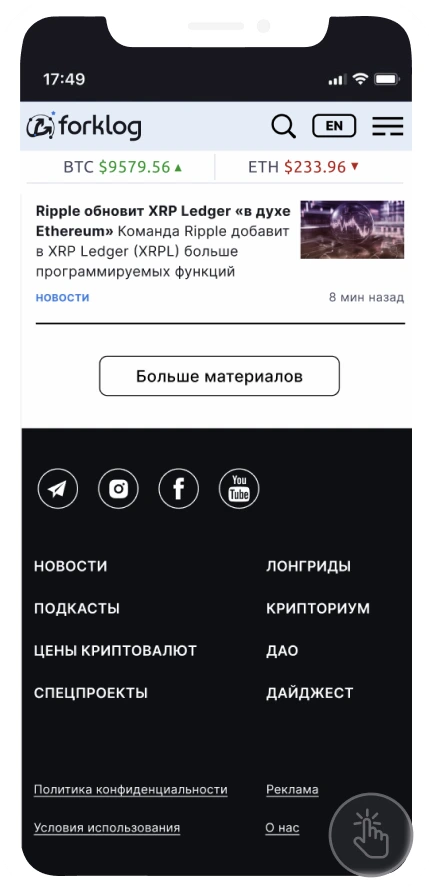
Simplified the navigation by prioritizing the most frequently used sections in the main menu while moving secondary items into a burger menu, reducing visual noise and improving content orientation. Additionally, the footer was redesigned with a clearer grid structure and expanded navigation links to improve accessibility and overall site navigation.


Introduced additional navigation and content discovery elements, including key thematic tags integrated within the news feed and a curated "Top Events of the Month" section. These additions improved content discoverability, increased user engagement, and contributed to higher conversion rates.
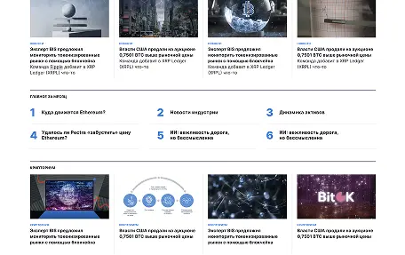
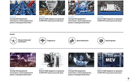
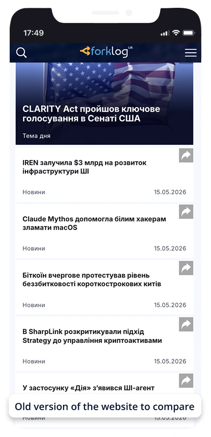
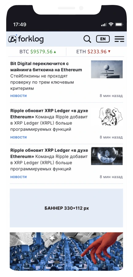
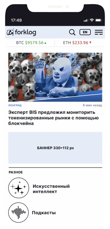
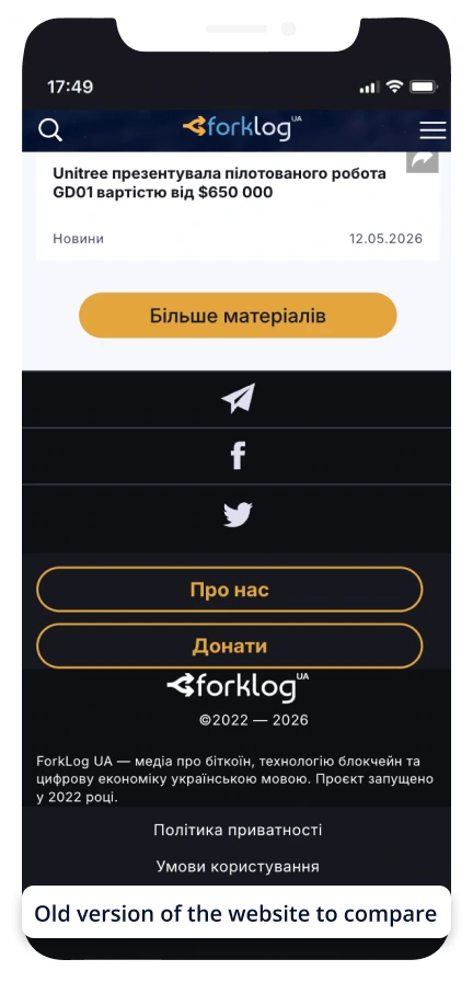
Redesigned the mobile experience by simplifying navigation, improving menu accessibility through a top-right placement, and integrating additional illustrations into the news feed to create a more engaging and content-driven interface.
Secondary logo
Variation of dotted elements from the main logo. Can be applied in illustrations and supporting UI elements as an additional visual accent.

Corporate colors
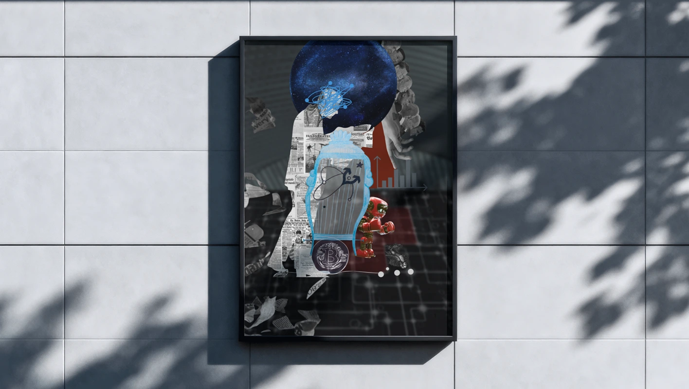
The accent colors chosen are two shades of blue and red, which are used in the logo and main covers of social networks. Service neutral tones are used in the website layout and other brand elements.
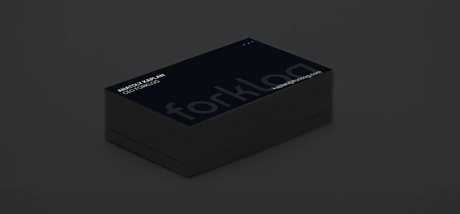
Business cards
T-shirts
Result: Following the rebrand and platform redesign, the website experienced a significant increase in conversion rates, helping grow the platform from 700K to 1 million monthly active users.