Æternity is a third-generation blockchain platform for building decentralized applications and scalable smart contracts.
- Create a landing page for a branded longread developed for Tezos Ukraine and published on forklog.com.
- Build the visual concept around the theme of resistance to ASIC mining.
- Highlight æternity's use of the Cuckoo Cycle PoW algorithm and the possibility of transitioning to an ASIC-friendly version in the future.
Research steps
- Customer identity research.
- Study of various products of the similar cryptocurrency subject.
- Review of different sites about ASICs.
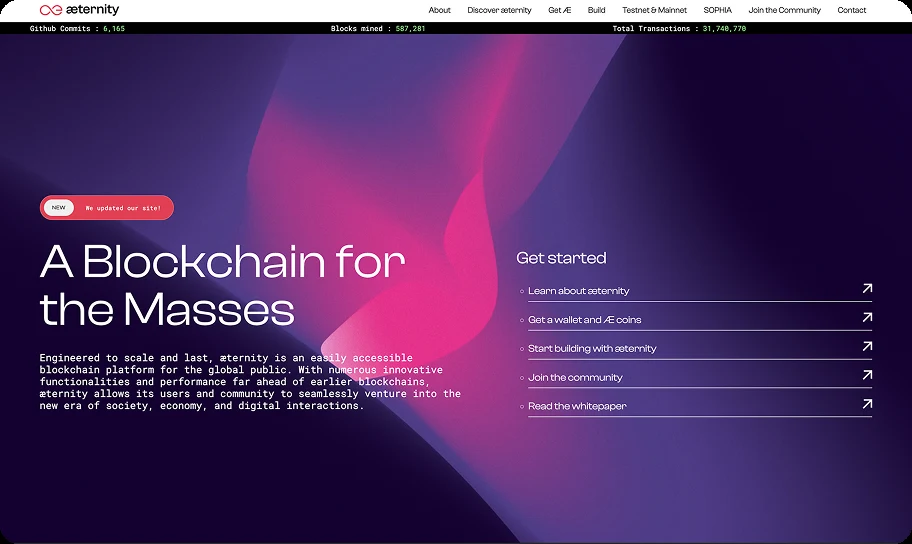
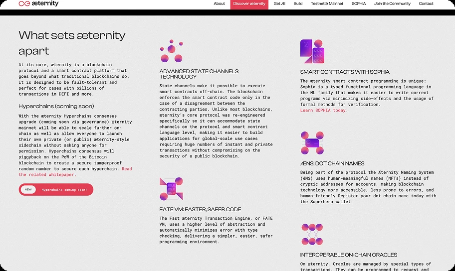
Pink is one of æternity's corporate colors, and its logo was used across the reference screenshots to represent the company's product.
Wireframing
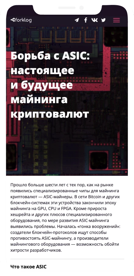
The wireframes established a clear content hierarchy for the longread, balancing editorial text, illustrations, navigation, and calls to action. Desktop and mobile layouts were developed in parallel to ensure comfortable reading, intuitive navigation, and a consistent experience across screen sizes.

UI design
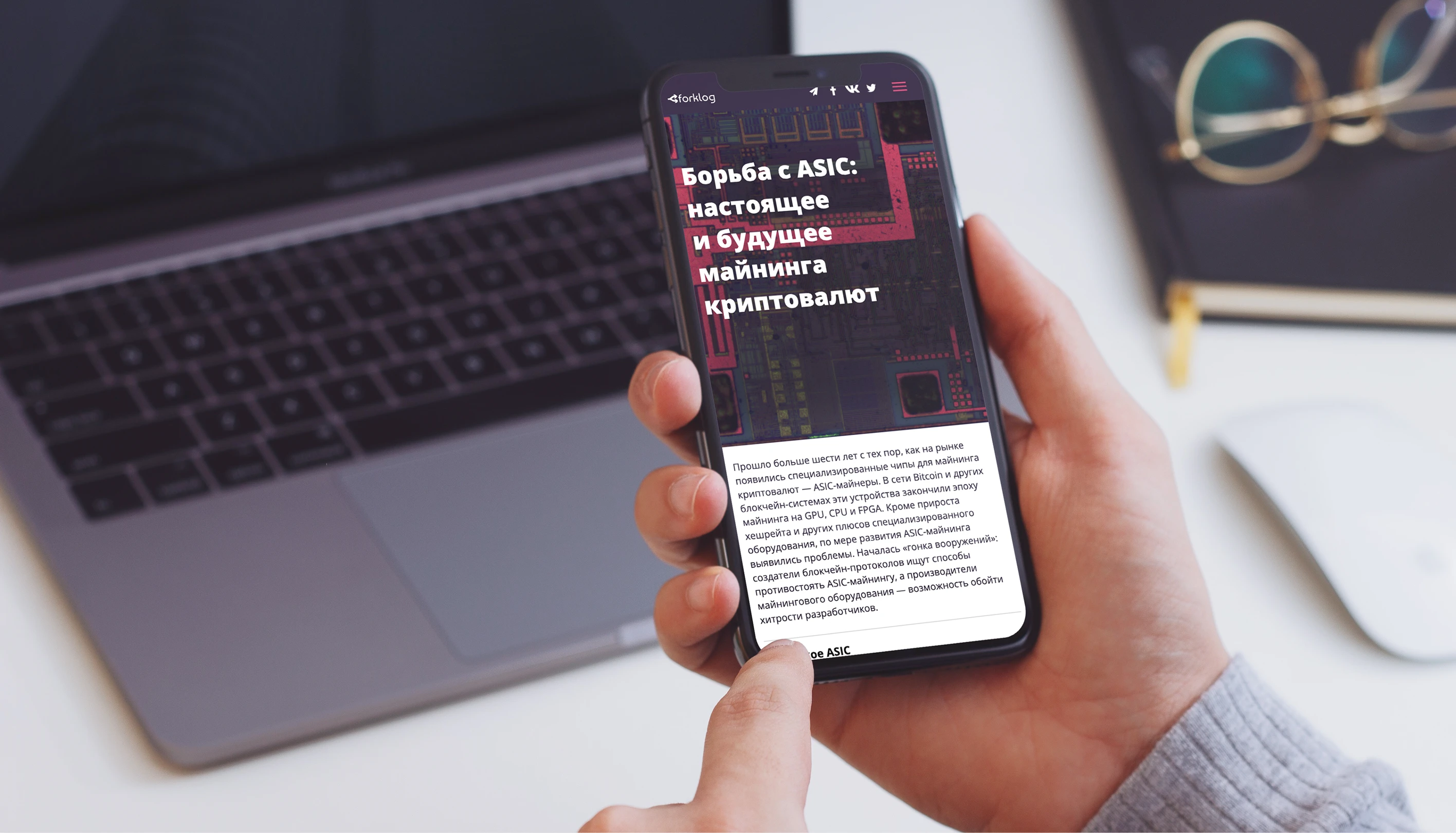
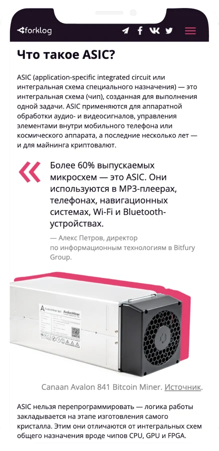
Following the æternity brand identity, research and the sign off the wire-frames I began design of the user interface. The photo of the motherboard creates technological mood. Line height serves as the basis for the grid, which makes the page more structured.
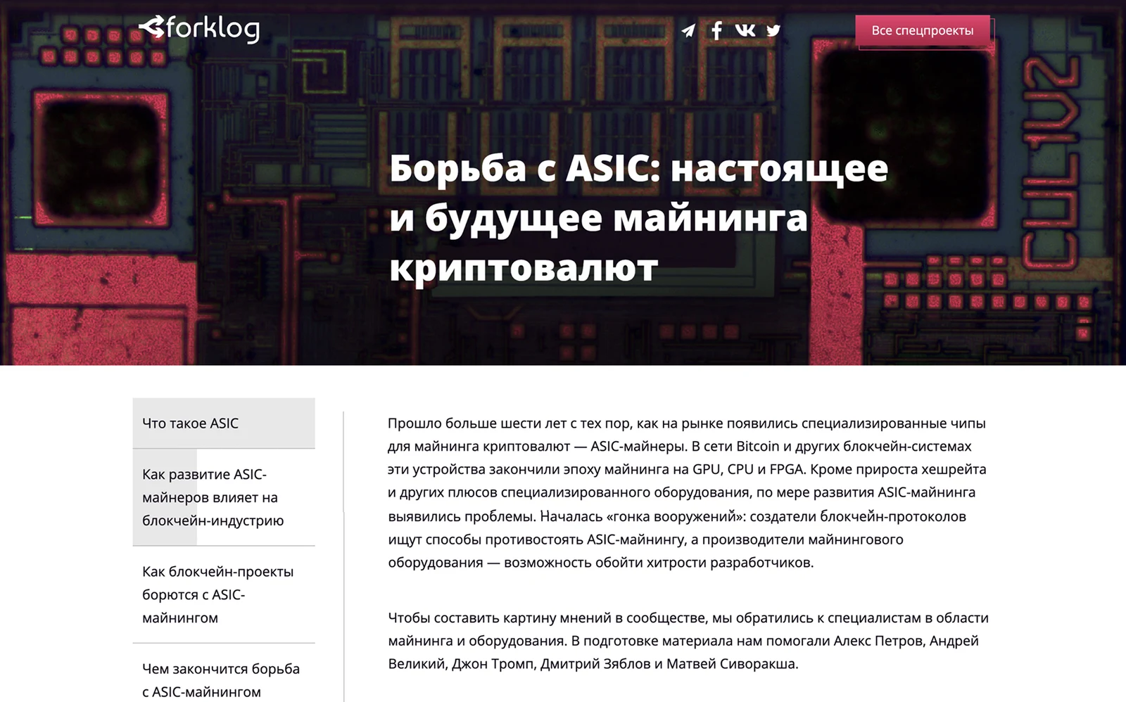
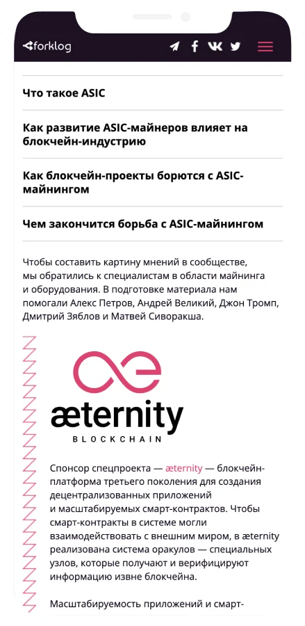
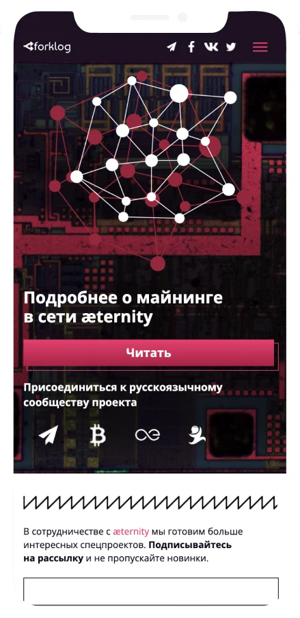
The longread combines clear typography, chapter navigation, highlighted quotes, and visual explanations for comfortable reading. The final section adds prominent calls to action, community links, and a newsletter subscription form to encourage further engagement.
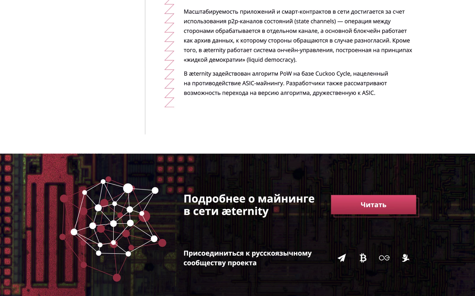
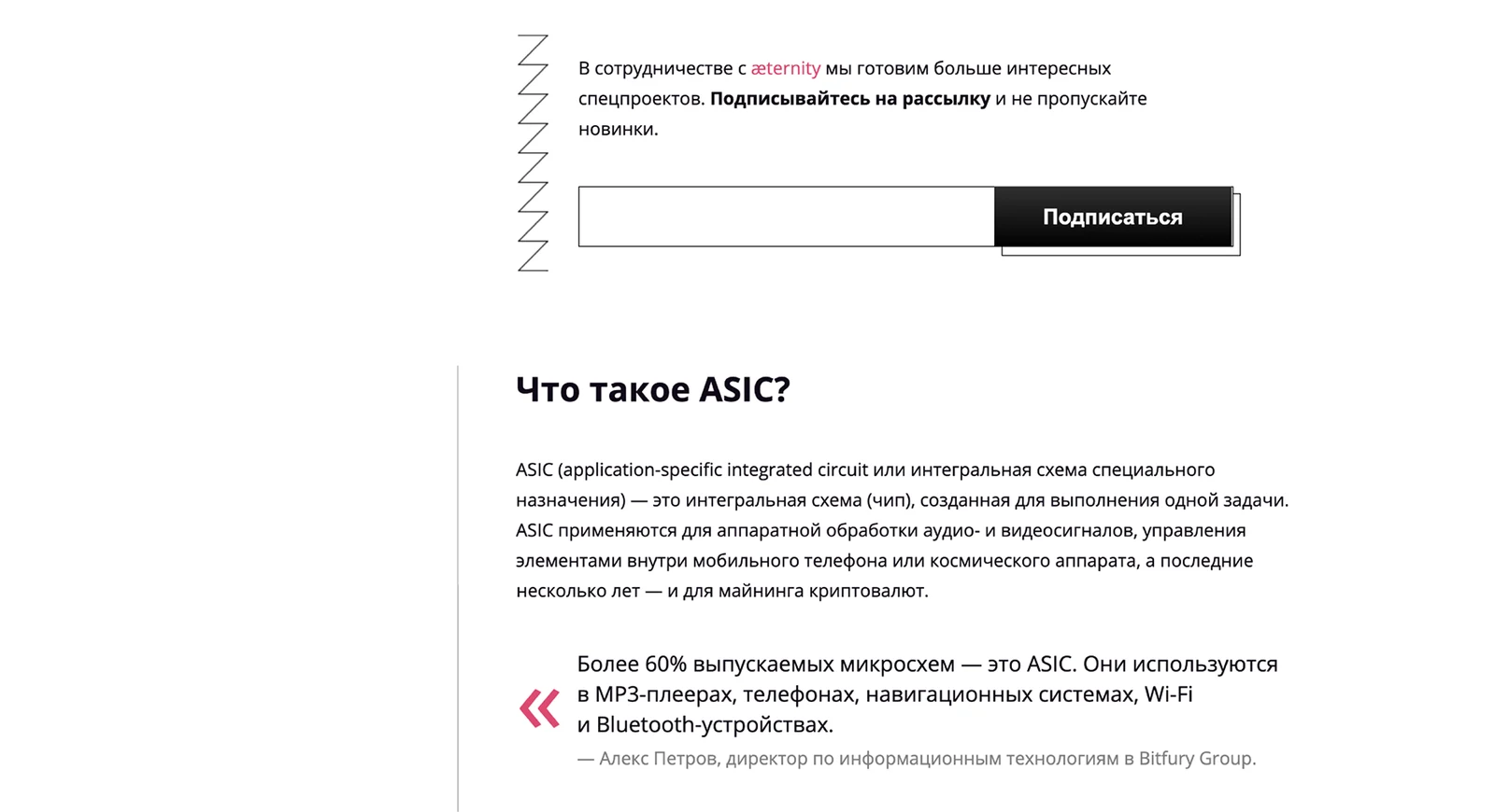
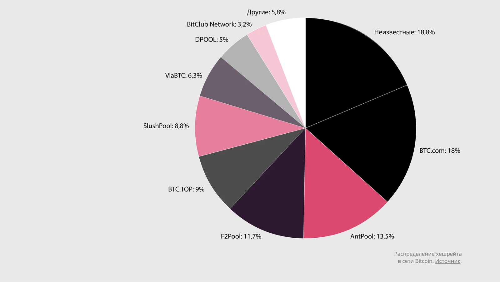
A distinctive visual language was created by combining photography, minimal line illustrations, geometric forms, and bright pink brand accents. Circuit-inspired patterns and angular graphic elements connect the visuals to the themes of mining, hardware, and blockchain technology.
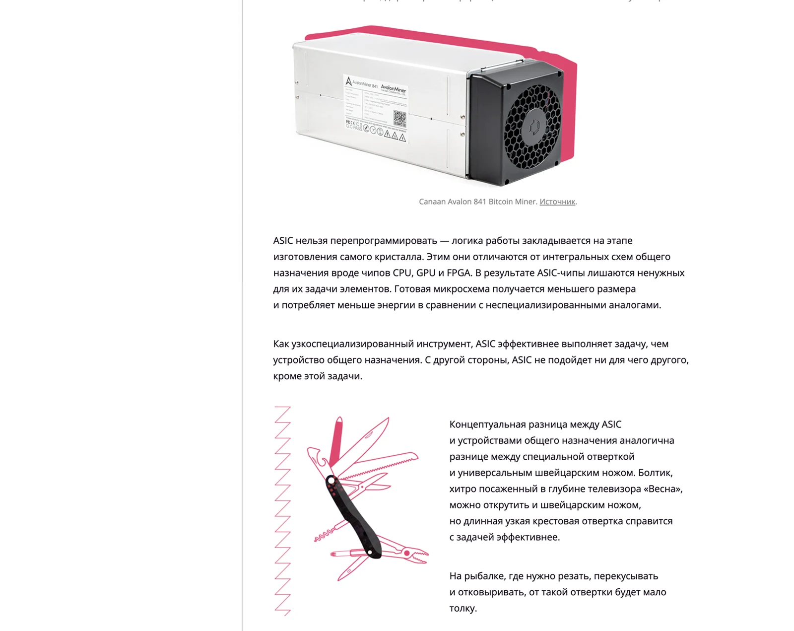
Adapted the landing page for mobile screens by reorganizing content into a clear vertical flow, simplifying navigation, and optimizing typography, illustrations, and calls to action for comfortable browsing on smaller devices.
Typography
Open Sans was selected for its clarity and neutral, technical character, keeping long passages of explanatory text comfortable to read across both the desktop and mobile layouts.
Open Sans
ABCDEFGHIJKLMNOPQRSTUVWXYZ
abcdefghijklmnopqrstuvwxyz
1234567890
Colors
Color scheme is based on the customer's identity. Illustration style correlates with forklog.com style. Thus we get a combination of styles of the customer and the site where the project is published.
Result: The branded longread was published on forklog.com and reached æternity's target crypto audience, strengthening the brand's association with fair, ASIC-resistant mining across the platform's Russian-speaking community.